
The Corner Lofts
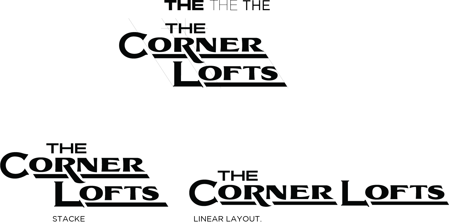
The Corner Lofts consists of 7 inter-connected buildings that were built between 1866 and 1875. In 2006, it was completely gutted and renovated into an apartment complex in the heart of downtown Richmond, VA. This was a multi-facetted design project where I needed to create multiple designs that could be interlaced without competing. Essentially the client wanted a strong, bold, original look for the exterior signage, while also creating a design style for interior and directional uses that best exemplifies the time period of the building.
A rather large design element.
The challenge of this project was to create a design that would appear both modern and uniquely suited to an 160 year old building. I decided on splitting up my time periods references, using the 1920’s Main Street style of signage for my overall layout, and used modified Eurostile, a font from the 1950’s. Both the font and layout of the design were strong and bold that matched up well with the Greek Revival style of the building and for visibility in its final location. The client fell in love with this layout, two rather large design elements, at ten foot tall, projecting four feet off of the wall. It’s hard to miss at the intersection of 14th and Main Street.


Layouts, Designs, and Curve balls
With the exterior elements approved, I moved on to the next phase, interior branding and identification designs. The client originally wanted to stay with the Eurostile font used on the main designs for the exterior of the building, but also wanted a more decorative approach. Incorporating Eurostile, and a Letter Head Imperial style font seemed to be a solid direction from what I took from our conversations.
Happy Medium
Turns out I was thrown a curve ball, after a few phone calls, and emails, the client wanted to see a font option that was more folksy, and letter press-like, something with the feel of the end of the century. With that in mind, I decided to use the a version of the Hightower font. I felt it had a nice asymmetrical variation to it that still looked solid and was easily readable at a variety of sizes, and uses.

